

How to choose paint colours for every room orientation
How natural light enters a room can dramatically change how paint colours appear, so choosing shades based on room orientation can help create a balanced, inviting space.
You don’t need to be an interior designer to understand how light changes a home! This guide breaks down the best paint colours for north, east, south, and west-facing rooms – helping you enhance warmth, counteract cool tones, and make the most of natural light throughout the day.
How to choose paint colours based on room orientation
Choosing a colour to complement a room depends on many factors; how light moves across the space throughout the day and seasons, room functionality, and of course, personal taste. It is well known that colour greatly influences both mood, and perception of space, and so selecting the right shade for a room’s purpose and orientation is key to enhancing comfort, warmth, productivity, or even conversation.
Depending on the light exposure, a colour that looks soft and inviting in one room may feel stark or flat in another. Considering the room’s natural light, you can choose hues that enhance its best qualities and create a balanced, harmonious atmosphere.
A room’s size and existing furnishings must also be considered when decorating. For example, a north-facing home office could benefit from warm, uplifting tones to balance the cooler light during office hours, while a west-facing bedroom attracts calm blues to soften late summer sunsets.
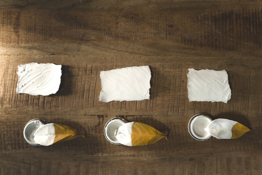
Don’t be afraid to paint large pieces of paper with colour samples to stick to your walls for a few months before deciding; seeing how they sit within a room in all weathers and heights of the sun will ensure you choose one that works for your space.
Best colours for north-facing rooms
North-facing rooms tend to receive limited natural light, and the light they get is dark and cool. To counteract this northern light, opt for shades with warm tones: neutrals mixed with yellow, pink or red, earthy greens, terracotta pinks, peachy yellows, or even blues laced with green.

Bright whites and very light colours should be avoided in rooms with a northern exposure, as rather than brightening, it can make the space feel flat. Dark shades can also work well here for those who want to embrace a sense of drama or a cocooning feel, so long as warm tones reign over cool.
Best colours for east-facing rooms
In contrast to north-facing rooms, east-facing spaces enjoy changing light throughout the day, with mornings being bright and radiant, evenings more subdued. For these rooms, yellows enhance first light while warming the later part of the day, and neutrals with soft red undertones work well to maintain warmth as the sun moves out of sight.
Avoid cool-toned greys and intense colours, as they make the room feel cold in the afternoon. To embrace the changing light, consider layering warm and cool tones to create a balanced look. For example, pairing a soft peach or pink with warm white or a forget-me-not blue trim can keep the room inviting in the morning while preventing it from looking too bare in the evening.

Adding warm artificial lighting with soft lampshades or amber bulbs can also help maintain a cosy feel after sunset.
Best colours for south-facing rooms
South-facing rooms enjoy bright light throughout the day, offering a forgiving space to play with paint colour and bold patterns. Here is where cooler colours and whites shine, although be careful with pastels, which can wash out with all that sought-after sunlight.
Bright oranges, intense yellows, or deep reds can sometimes be overpowering in southerly rooms, so choose shades with cooler undertones to balance out intense sunshine. Dark, moody colours really come into their own here, and can dramatically mellow the feel of a room when midsummer light enters; to get this finish with a sustainable mineral paint, Beeck Maxil Pro offers a range of deep shades.

To make the most of a south-facing room, consider how the light changes throughout the day, and how the room will be used; a family lounge may suit an energising green, whereas a bedroom may benefit from an inky blue.
Best colours for west-facing rooms
When decorating a west facing room, it’s worth considering when you’ll most likely be using the space. In the morning, the room may receive little to no direct sunlight in the morning, but brightening up once the afternoon arrives. Depending on how you use the space will depend significantly on what colours you choose; if your cosy morning coffee spot is west-facing, you may want to choose a warm yellow to brighten up the cool light. If it’s your dining room however, you may want to offset the heat with a soft blue limewash.
It’s worth noting, that artifical light can also impact the appearance and feel of your paint. Just like natural light, artificial lighting can affect how colours appear. Light bulb colors are measured using the Kelvin (K) scale, running from warm yellow tones to cool daylight blues.

Warm neutrals do well in west-facing rooms, as they brighten mornings and complement evening light, but do be careful with reds and oranges, as they may feel overwhelming as the sun sets and throws heat across the walls.
Learn more about mineral paints
Summing it up
Choosing the right colours for your rooms based on their orientation can transform your house’s ambience, style and functionality. Whether redecorating your lounge, the children’s bedrooms or kitchen-diner, your chosen shades and the room’s direction can promote joy, encourage rest, or even spark conversation.